-
Beek – 19-04-21
- Artist Name Corne Akkers
- Year 2021
- Portfolio Name Drawings - Corne Akkers
- Art Form Drawings / Sketch
- Size 21 (cms) H x 30 (cms) W
- Style Cubism, Fine Art, Impressionism, Realism
- Genre Botanical, Figurative, Inspirational, Landscape, Nature
- Media Pencil
- Price $1,760.00
- Keywords akkers, artist, artista, arts, clairobscur, corne, corneakkers, drawing, 인상주의, figurative, finearts, 印象派, hatching, 印象派, kunst, city, Импрессионизм, אימפרסיוניזם, beek, ubbergen, impressionism, impressionism, graphite, pencil, potlood, tekening, zeichnung, انطباعيةr, abstractie, art, arte, arta, artista, artiste, artist, realism, realisme, realistic, realiste, realist, kunst, 藝術, アート, искусство, արվեստ, קונסט, nghệthuật, فن, ხელოვნება, művészet, 艺术, seni, សិល្បៈ, कला, 印象派, treescape, roundism, rondisme, cubism, cubisme
-
Canvas -

Paper/Poster -

Metal -

Coffee Mug
(various colors) -

Magic Color Changing Mug -

Men T-shirt
(various colors) -

Men's Vapor Apparel T-shirts
(various colors) -

Men's Vapor Apparel Long Sleeves
(various colors) -

Men's Vapor Appareal Performance Hoodie Long Sleeve Sweatshirt
(various colors) -

Men's Vapor Apparel Solar Performance Polo T-Shirts
(various colors) -

Men's Vapor Apparel Performance Long Sleeve Sweatshirts
(various colors) -

Youth Basic T-shirts
(various colors) -

Youth Solar Performance T-shirts
(various colors) -

Women's T-Shirts
(various colors) -

Women's Vapor Apparel Solar Performance Short Sleeves
(various colors) -

Soft Mouse Pad -

Rosewood Wine Gift Box -

Laptop Shoulder Bag -

Shopping Tote Bag
(various models) -

Flip Flops -

Slide On Sandals -

Satin Pillow Case -

Travel Luggage Tag (Fiber Reinforced Plastic) -

Glass Coaster
(various shapes) -

Gloss White Hardboard Coaster with Cork Back
(various shapes) -

Name Badge
(various shapes) -

Solid Red Alder Pet Urn
(various sizes) -

Lunch Tote with Handle -

BBQ Set in Wooden Pine Box -

Hardbound Portfolio Cover for Legal Note Pad Inside -

Wine and Cheese Gift Box -

Aprons
(various models) -

Gift Box With Ceramic Tile -

Puzzles
(various shapes) -

Rectangular Glass Cutting Board -

Cooler Bag -

Serving Trays
(various options) -

Small Fleece Baby Burp Blanket -

Baby Onesies


Product Description
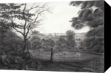
Realism a Gateway This drawing of Beek is a continuation of previous graphite pencil drawings like Marlot – 04-04-21. In these latest series of I set out to sharpen my feel for realism meeting my roundistic principles. Of course I see abstract phenomena in real objects already for a long time. It is of late that I tend to turn a different corner though. The almighty Dali once said that turning to realism in the long run is inevitable. To this I would like to make ammends. Realism is the only gateway to draw the spectator further into the abyss of the implicite order. The effects of its non-physical laws are clear to me everywhere around me. Thus I feel it as a privilege bestowed upon me to tell the tale. Everything Comes in Curves When walking in nature I see all things come in curves. The more I study the golden ratio, the more I see that all things organic are the opposite of straightness. In this study I stretched the depiction further towards a realistic image but kept subtle abstract forms intact. The immediate reason for this was that someone thought the Marlot drawing to be a photo. That was proof that these abstract forms tricked people into believing the scenery to be real. Surely I can make a sound statement out of these findings. We automatically associate all organic phenomena with reality we are part of, how abstracted or styled they may be. The Actual Spot If you want to visit the spot where I drew this one, it is at the beginning of The Smorenhoek. You can find it at Beek, Gelderland, Netherlands. The Smorenhoek is an meadow area between two hills. In the lowest part near the Rijksstraatweg there is this incredible view over Beek. In the distance you can see the Ooijpolder as well. Perhaps the contrast between hillsides and the flat lands in the polder is what I like the most. It reminds me to one of the Bauhaus principles: contrasts make the world go round. A straight horizon framed by round shapes. Graphite pencil drawing (Pentel 0.5 mm, 3B) on Talens Bristol paper (21 x 29.7 x 0.1 cm - A4 format) Artist: Corné Akkers
Beek – 19-04-21 was created by artist Corne Akkers in 2021. This art piece , which is part of the Drawings - Corne Akkers portfolio, is a Drawings / Sketch artwork. The style of this artwork is best described as Cubism, Fine Art, Impressionism, Realism. The genre portrayed in this piece of art is Botanical, Figurative, Inspirational, Landscape, Nature. The artwork was created in Pencil. The size of the original art is 21 (cms) H x 30 (cms) W.
Words which artist Corne Akkers feels best describe this work of art are: akkers, artist, artista, arts, clairobscur, corne, corneakkers, drawing, 인상주의, figurative, finearts, 印象派, hatching, 印象派, kunst, city, Импрессионизм, אימפרסיוניזם, beek, ubbergen, impressionism, impressionism, graphite, pencil, potlood, tekening, zeichnung, انطباعيةr, abstractie, art, arte, arta, artista, artiste, artist, realism, realisme, realistic, realiste, realist, kunst, 藝術, アート, искусство, արվեստ, קונסט, nghệthuật, فن, ხელოვნება, művészet, 艺术, seni, សិល្បៈ, कला, 印象派, treescape, roundism, rondisme, cubism, cubisme.
About Corne Akkers
My work can be seen in many countries all over the world. I employ a variety of styles that all have one thing in common: the ever search for the light on phenomena and all the shadows and light planes they block in. My favorites in doing so are oil paint, dry pastel and graphite pencil. It is not the form or the theme that counts but the way planes of certain tonal quality vary and block in the lights. Colours are relatively unimportant and can take on whatever scheme. It is the tonal quality that is ever present in my work, creating the illusion of depth and mass on a flat 2d-plane. I combine figurative work with the search for abstraction because neither in extremo can provide the desired art statement the public expects from an artist. Besides all that, exaggeration and deviation is the standard and results in a typical use of a strong colour scheme and a hugh tonal bandwith, in order to create art that, when the canvas or paper would be torn into pieces, in essence still would be recognizable.
I teach art (drawing / painting) at Voorburg, Netherlands where I have my second studio next to my first at The Hague, Netherlands, where I live.


