-
Clingendael – 31-08-22
- Artist Name Corne Akkers
- Year 2022
- Portfolio Name Drawings - Corne Akkers
- Art Form Drawings / Sketch
- Size 24 (cms) H x 31 (cms) W
- Style Fine Art, Impressionism, Realism
- Genre Composition, Figurative, Inspirational, Landscape
- Media Pencil
- Price $320.00
- Keywords artist, artista, clingendael, thehague, artprint, artposter, print, poster, arts, clairobscur, drawing, 인상주의, figurative, finearts, 印象派, 印象派, kunst, Импрессионизм, אימפרסיוניזם, treescape, impressionism, impressionism, graphite, pencil, zeichnung, انطباعيةr, abstractie, art, arte, arta, artista, artiste, artist, realism, realisme, realistic, realiste, realist, kunst, 藝術, アート, искусство, արվեստ, קונסט, nghệthuật, فن, ხელოვნება, művészet, 艺术, seni, សិល្បៈ, कला, 印象派
-

Canvas -

Paper/Poster -

Metal -

Coffee Mug
(various colors) -

Magic Color Changing Mug -

Men T-shirt
(various colors) -

Men's Vapor Apparel T-shirts
(various colors) -

Men's Vapor Apparel Long Sleeves
(various colors) -

Men's Vapor Appareal Performance Hoodie Long Sleeve Sweatshirt
(various colors) -

Men's Vapor Apparel Solar Performance Polo T-Shirts
(various colors) -

Men's Vapor Apparel Performance Long Sleeve Sweatshirts
(various colors) -

Youth Basic T-shirts
(various colors) -

Youth Solar Performance T-shirts
(various colors) -

Women's T-Shirts
(various colors) -

Women's Vapor Apparel Solar Performance Short Sleeves
(various colors) -

Soft Mouse Pad -

Rosewood Wine Gift Box -

Laptop Shoulder Bag -

Shopping Tote Bag
(various models) -

Flip Flops -

Slide On Sandals -

Satin Pillow Case -

Travel Luggage Tag (Fiber Reinforced Plastic) -

Glass Coaster
(various shapes) -

Gloss White Hardboard Coaster with Cork Back
(various shapes) -
Name Badge
(various shapes) -

Solid Red Alder Pet Urn
(various sizes) -

Lunch Tote with Handle -

BBQ Set in Wooden Pine Box -

Hardbound Portfolio Cover for Legal Note Pad Inside -
Wine and Cheese Gift Box -

Aprons
(various models) -

Gift Box With Ceramic Tile -

Puzzles
(various shapes) -

Rectangular Glass Cutting Board -

Cooler Bag -

Serving Trays
(various options) -

Small Fleece Baby Burp Blanket -

Baby Onesies


Product Description
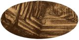
A Welcome Change Today, the last day of August, I went to Clingendael with my dear friend Michelle. It’s a welcome change from drawing art deco models, such as the last one. We were out there to take some landscape pictures and to do some drawing. Quite nice weather I must say. It’s still summer, no wind and plenty of sun although not as hot as last week. Perfect for outdoor sketching. However, when I arrived at the estate I realized I forgot my camping chairs. Those are unconfortable to transport by bike anyway. The only option left was to find a suitable bench in the woods or tree trunk to sit on. Condition number two is to have an interesting motif in front of your eyes. Spotting artistic motifs outdoors is an art on itself. You’d better walk because finding one on bike or in your car seems almost impossible. Atlantic Wall Basically we were walking to and fro with no great sights in view. Then we came to the anti-tank wall, part of the Atlantic Wall and remnant of Word War II. It’s a promiment feature in the park covered by trees and a dense carpet of moss and grass. In front of it there are straight aligned water canals. The wall itself rises some 10 meters upwards and creates wonderful diagonally cast shadows. Luckily there were some abovemeant benches and we had a great view on the head side of the canal. Berckheyde Immediately I thought of Gerrit Berckheyde’s view on the Herengracht in Amsterdam. He painted consecutive rows of light beams shining through empty slots between 17th century houses. I saw something similar happening with regards to light beams between trees in front of me. That’s always a highway to tonal success. You have to know a dense forest can look amorphous. That’s why it took sometime to find a perfect spot. This was the one. Changing Light Live drawing is the best, always! It enables you to see more and the presence in nature, sitting for 2 hours in one spot, is simply mesmerizing. I was curious to test my new pencils and Ingres paper outdoors. I must say it was very comfortable. I was able to hatch up the paper in a jiffy. Hence they enable me to make more artistic considerations along the way. With regular pencils and Bristol paper that is much more difficult because hatching paper consumes lots of time. Consequently I was able to capture the every changing light very quickly. Therefor I cherrypicked the most attractive leafy places throughout the timespan of 2 hours and put them on paper. With thanks to our German friends who built the lovely wall 80 years ago. Danke schön. Pitt Graphite Matt pencil (Faber-Castell) drawing on Hahnenmühle paper (24 x 31 x 0.1 cm) Artist: Corné Akkers
Clingendael – 31-08-22 was created by artist Corne Akkers in 2022. This art piece , which is part of the Drawings - Corne Akkers portfolio, is a Drawings / Sketch artwork. The style of this artwork is best described as Fine Art, Impressionism, Realism. The genre portrayed in this piece of art is Composition, Figurative, Inspirational, Landscape. The artwork was created in Pencil. The size of the original art is 24 (cms) H x 31 (cms) W.
Words which artist Corne Akkers feels best describe this work of art are: artist, artista, clingendael, thehague, artprint, artposter, print, poster, arts, clairobscur, drawing, 인상주의, figurative, finearts, 印象派, 印象派, kunst, Импрессионизм, אימפרסיוניזם, treescape, impressionism, impressionism, graphite, pencil, zeichnung, انطباعيةr, abstractie, art, arte, arta, artista, artiste, artist, realism, realisme, realistic, realiste, realist, kunst, 藝術, アート, искусство, արվեստ, קונסט, nghệthuật, فن, ხელოვნება, művészet, 艺术, seni, សិល្បៈ, कला, 印象派.
About Corne Akkers
My work can be seen in many countries all over the world. I employ a variety of styles that all have one thing in common: the ever search for the light on phenomena and all the shadows and light planes they block in. My favorites in doing so are oil paint, dry pastel and graphite pencil. It is not the form or the theme that counts but the way planes of certain tonal quality vary and block in the lights. Colours are relatively unimportant and can take on whatever scheme. It is the tonal quality that is ever present in my work, creating the illusion of depth and mass on a flat 2d-plane. I combine figurative work with the search for abstraction because neither in extremo can provide the desired art statement the public expects from an artist. Besides all that, exaggeration and deviation is the standard and results in a typical use of a strong colour scheme and a hugh tonal bandwith, in order to create art that, when the canvas or paper would be torn into pieces, in essence still would be recognizable.
I teach art (drawing / painting) at Voorburg, Netherlands where I have my second studio next to my first at The Hague, Netherlands, where I live.


