-
Den Haag – Nieuwe Kerk – 26-05-23 (sold) - Coffee Mug


Product Description
White Ceramic Coffee Mug 11 oz.
Buy Den Haag – Nieuwe Kerk – 26-05-23 (sold) Coffee Mug Art Print by artist Corne Akkers available at Artist.com. Check out the Coffee Mug Art Print collections available at Artist.com.
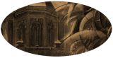
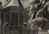
Old and New This graphite pencil drawing ‘Den Haag – Nieuwe Kerk – 28-05-23’ takes me back to my present residence. There is this remarkable church smack in the middle of The Hague that’s ancient. It deviates slighty from its direct surroundings. Take City Hall on the other side of the street (Spui) for example, designed by famous architect Richard Meier . Such is life here, full of contrasts in old and new. Another example is Burger King, farther down that same road. Perhaps it is not very imaginable for Americans. I’m talking about the franchise appearance and the architectural beauty of the facade above it. It’s that much big a contrast that they almost look like two separate buildings stacked on top of eachother. Could it be that such contrasts also represent a inner felt separation in many people nowadays. What do you think? They’re Back! Not that I detest change. That’s always needed and I also try to incorporate it as theme in my works througout the years. I’m wandering from surrealism, cubism to realism, epressionism and back. Sometimes I incorporate a couple of these -isms in one and the same work. Doing this one I vaguely had a previous drawing in mind. In Maassluis – 08-06-21 In that one I united my personal style roundism with realism. I wanted to get the treescapes plausible in such respect that people wouldn’t be bothered by style differences. Such was my goal today as well but I also incorporated an elepant. After the initial one in 2016 they’re back and so I spotted one lingering about on the lawn in front of the church. Would you call this surrealism or is it just another realist drawing? Graphite pencil drawing (Sakura 0.5 mm, 4B) on Winsor & Newton Bristol board paper (21 x 14.8 x 0.1 cm – A5 format) Artist: Corné AkkersAbout Corne Akkers
My work can be seen in many countries all over the world. I employ a variety of styles that all have one thing in common: the ever search for the light on phenomena and all the shadows and light planes they block in. My favorites in doing so are oil paint, dry pastel and graphite pencil. It is not the form or the theme that counts but the way planes of certain tonal quality vary and block in the lights. Colours are relatively unimportant and can take on whatever scheme. It is the tonal quality that is ever present in my work, creating the illusion of depth and mass on a flat 2d-plane. I combine figurative work with the search for abstraction because neither in extremo can provide the desired art statement the public expects from an artist. Besides all that, exaggeration and deviation is the standard and results in a typical use of a strong colour scheme and a hugh tonal bandwith, in order to create art that, when the canvas or paper would be torn into pieces, in essence still would be recognizable.
I teach art (drawing / painting) at Voorburg, Netherlands where I have my second studio next to my first at The Hague, Netherlands, where I live.
Additional Products
-
![Canvas Print]()
Den Haag – Nieuwe Kerk – 26-05-23 (sold) - Canvas Print -
![Paper/Poster Print]()
Den Haag – Nieuwe Kerk – 26-05-23 (sold) - Paper/Poster Print -
![Metal Print]()
Den Haag – Nieuwe Kerk – 26-05-23 (sold) - Metal Print -
![Magic Color Changing Mug]()
Den Haag – Nieuwe Kerk – 26-05-23 (sold) - Magic Color Changing Mug -
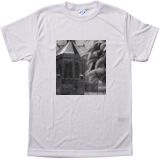
![Mens T-shirt]()
Den Haag – Nieuwe Kerk – 26-05-23 (sold) - Men T-shirt
(various colors) -
![Men's Vapor Apparel - White]()
Den Haag – Nieuwe Kerk – 26-05-23 (sold) - Men's Vapor Apparel T-shirts
(various colors) -
![Men's Vapor Apparel Long Sleeve - White]()
Den Haag – Nieuwe Kerk – 26-05-23 (sold) - Men's Vapor Apparel Long Sleeves
(various colors) -
![Men's Vapor Appareal Performance Hoodie Long Sleeve Sweatshirt - white]()
Den Haag – Nieuwe Kerk – 26-05-23 (sold) - Men's Vapor Appareal Performance Hoodie Long Sleeve Sweatshirt
(various colors) -
![Men's Vapor Apparel Solar Performance Polo T-Shirt - White]()
Den Haag – Nieuwe Kerk – 26-05-23 (sold) - Men's Vapor Apparel Solar Performance Polo T-Shirts
(various colors) -
![Men's Vapor Apparel Performance Long Sleeve Sweatshirt - White]()
Den Haag – Nieuwe Kerk – 26-05-23 (sold) - Men's Vapor Apparel Performance Long Sleeve Sweatshirts
(various colors) -
![Youth Basic T - White]()
Den Haag – Nieuwe Kerk – 26-05-23 (sold) - Youth Basic T-shirts
(various colors) -
![Youth Solar Performance T - White]()
Den Haag – Nieuwe Kerk – 26-05-23 (sold) - Youth Solar Performance T-shirts
(various colors) -
![Women's T-Shirt - White]()
Den Haag – Nieuwe Kerk – 26-05-23 (sold) - Women's T-Shirts
(various colors) -
![Women's Vapor Apparel Solar Performance Short Sleeve - White]()
Den Haag – Nieuwe Kerk – 26-05-23 (sold) - Women's Vapor Apparel Solar Performance Short Sleeves
(various colors) -
![Soft Mouse Pad]()
Den Haag – Nieuwe Kerk – 26-05-23 (sold) - Soft Mouse Pad -
![Rosewood Wine Gift Box]()
Den Haag – Nieuwe Kerk – 26-05-23 (sold) - Rosewood Wine Gift Box -
![Laptop Shoulder Bag]()
Den Haag – Nieuwe Kerk – 26-05-23 (sold) - Laptop Shoulder Bag -
![Shopping Tote Bag]()
Den Haag – Nieuwe Kerk – 26-05-23 (sold) - Shopping Tote Bag
(various models) -
![Flip Flops]()
Den Haag – Nieuwe Kerk – 26-05-23 (sold) - Flip Flops -
![Slide On Sandals]()
Den Haag – Nieuwe Kerk – 26-05-23 (sold) - Slide On Sandals -
![Satin Pillow Case]()
Den Haag – Nieuwe Kerk – 26-05-23 (sold) - Satin Pillow Case -
![Travel Luggage Tag (Fiber Reinforced Plastic)]()
Den Haag – Nieuwe Kerk – 26-05-23 (sold) - Travel Luggage Tag (Fiber Reinforced Plastic) -
![Glass Coaster (Square)]()
Den Haag – Nieuwe Kerk – 26-05-23 (sold) - Glass Coaster
(various shapes) -
![Gloss White Hardboard Round Coaster with Cork Back]()
Den Haag – Nieuwe Kerk – 26-05-23 (sold) - Gloss White Hardboard Coaster with Cork Back
(various shapes) -
![Name Badge (Oval)]()
Den Haag – Nieuwe Kerk – 26-05-23 (sold) - Name Badge
(various shapes) -
![Solid Red Alder Pet Urn]()
Den Haag – Nieuwe Kerk – 26-05-23 (sold) - Solid Red Alder Pet Urn
(various sizes) -
![Lunch Tote with Handle]()
Den Haag – Nieuwe Kerk – 26-05-23 (sold) - Lunch Tote with Handle -
![BBQ Set in Wooden Pine Box]()
Den Haag – Nieuwe Kerk – 26-05-23 (sold) - BBQ Set in Wooden Pine Box -
![Hardbound Portfolio Cover for Legal Note Pad Inside]()
Den Haag – Nieuwe Kerk – 26-05-23 (sold) - Hardbound Portfolio Cover for Legal Note Pad Inside -
![Wine and Cheese Gift Box]()
Den Haag – Nieuwe Kerk – 26-05-23 (sold) - Wine and Cheese Gift Box -
![White Apron]()
Den Haag – Nieuwe Kerk – 26-05-23 (sold) - Aprons
(various models) -
![Gift Box With Ceramic Tile]()
Den Haag – Nieuwe Kerk – 26-05-23 (sold) - Gift Box With Ceramic Tile -
![Rectangular Shaped Gloss Hardboard Jigsaw Puzzle]()
Den Haag – Nieuwe Kerk – 26-05-23 (sold) - Puzzles
(various shapes) -
![Rectangular Glass Cutting Board]()
Den Haag – Nieuwe Kerk – 26-05-23 (sold) - Rectangular Glass Cutting Board -
![Cooler Bag]()
Den Haag – Nieuwe Kerk – 26-05-23 (sold) - Cooler Bag -
![Black Espresso Large Serving Tray]()
Den Haag – Nieuwe Kerk – 26-05-23 (sold) - Serving Trays
(various options) -
![Small Fleece Baby Burp Blanket]()
Den Haag – Nieuwe Kerk – 26-05-23 (sold) - Small Fleece Baby Burp Blanket -
![Baby Onesies]()
Den Haag – Nieuwe Kerk – 26-05-23 (sold) - Baby Onesies