-
Noteboompark – 06-04-23
- Artist Name Corne Akkers
- Year 2023
- Portfolio Name Drawings - Corne Akkers
- Art Form Drawings / Sketch
- Size 21 (cms) H x 15 (cms) W
- Style Fine Art, Impressionism, Realism
- Genre Figurative, Inspirational, Landscape, Nature
- Media Pencil
- Price $350.00
- Keywords art, artprint, print, artposter, poster, finearts, artcollector, collectingart, clairobscur, corne, corneakkers, drawing, 인상주의, figurative, finearts, 印象派, hatching, 印象派, Импрессионизм, אימפרסיוניזם, impressionism, voorburg, willow, willows, scenery, trees, treescape, holland, impressionism, graphite, pencil, انطباعيةr, artist, realism, realisme, realistic, realiste, realist, 藝術, アート, искусство, արվեստ, קונסט, nghệthuật, فن, ხელოვნება, művészet, 艺术, សិល្បៈ, कला, 印象派
-

Canvas -

Paper/Poster -

Metal -

Coffee Mug
(various colors) -

Magic Color Changing Mug -

Men T-shirt
(various colors) -

Men's Vapor Apparel T-shirts
(various colors) -

Men's Vapor Apparel Long Sleeves
(various colors) -

Men's Vapor Appareal Performance Hoodie Long Sleeve Sweatshirt
(various colors) -

Men's Vapor Apparel Solar Performance Polo T-Shirts
(various colors) -

Men's Vapor Apparel Performance Long Sleeve Sweatshirts
(various colors) -

Youth Basic T-shirts
(various colors) -

Youth Solar Performance T-shirts
(various colors) -

Women's T-Shirts
(various colors) -

Women's Vapor Apparel Solar Performance Short Sleeves
(various colors) -

Soft Mouse Pad -

Rosewood Wine Gift Box -

Laptop Shoulder Bag -

Shopping Tote Bag
(various models) -

Flip Flops -

Slide On Sandals -

Satin Pillow Case -

Travel Luggage Tag (Fiber Reinforced Plastic) -

Glass Coaster
(various shapes) -

Gloss White Hardboard Coaster with Cork Back
(various shapes) -

Name Badge
(various shapes) -

Solid Red Alder Pet Urn
(various sizes) -

Lunch Tote with Handle -

BBQ Set in Wooden Pine Box -

Hardbound Portfolio Cover for Legal Note Pad Inside -

Wine and Cheese Gift Box -

Aprons
(various models) -
Gift Box With Ceramic Tile -

Puzzles
(various shapes) -

Rectangular Glass Cutting Board -

Cooler Bag -

Serving Trays
(various options) -

Small Fleece Baby Burp Blanket -

Baby Onesies


Product Description
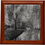
Willow Trees This graphite pencil drawing ‘Notenboompark – 06-04-23’ follows my sketch of lambs in Clingendael of last week. Suddenly I wanted to do one of Voorburg again, the city where I teach art. In fact Den Haag borders Voorburg so an outsider wouldn’t take notice crossing over. There is this strip of vegetation stretching from Den Haag all the way to estate ‘Vreugd en Rust’. Towards the end there is this cosy little ‘Noteboompark’, adjacent to the Juliana-Bernhard Park. That’s the one I cross through on my way to Brugman. The region Haaglanden (the greater The Hague) is well renown for its lush parks. You can find lots of ponds, weeping willows and what have you not. This one is no exception and I liked depicting these willows on the verge of Spring. It’s very cold though but the sunshine almost seems to scare away the icy northern wind. Not Much Contrast Whereas the previous drawing was full of hefty tonal variations this one is different. Before I go into details let me state I took a picture of the scenery. The photo was taken from a bridge where I couldn’t draw. Although the view was great the lighting wasn’t. So I took another photograph a day later. Finally it was sunny again and it lit the trees beautifully. This having said this one proved to be a tall order. The thin leaves didn’t contrast much with the blue sky. Only enough to make a difference so I can show the light on top of them. On the other hand, I got two reference pictures that showed the best of both worlds. The vantage point was a bit different though but that didn’t bother me. I could use the first photo and just use the other one to interpret the lighting. Water Reflections The wonderful part was the reflections in the water. I just love them like I have stated dozens of times before. The funny thing is that reflections give you both a recognition of the trees and the water as such. How about that for a double whammy? I only had to mirror structures to get a maximum effect. The bridge in the back is the actual bridge I almost cross daily. Can’t wait to get my foldable camping chair with me and sketch outdoors when it’ll be warmer. It’s still a freezing 9 degrees Celsius. Brrr! Graphite pencil drawing (Sakura 0.5 mm, 4B) on Winsor & Newton Bristol board paper (21 x 14.8 x 0.1 cm – A5 format) Artist: Corné Akkers
Noteboompark – 06-04-23 was created by artist Corne Akkers in 2023. This art piece , which is part of the Drawings - Corne Akkers portfolio, is a Drawings / Sketch artwork. The style of this artwork is best described as Fine Art, Impressionism, Realism. The genre portrayed in this piece of art is Figurative, Inspirational, Landscape, Nature. The artwork was created in Pencil. The size of the original art is 21 (cms) H x 15 (cms) W.
Words which artist Corne Akkers feels best describe this work of art are: art, artprint, print, artposter, poster, finearts, artcollector, collectingart, clairobscur, corne, corneakkers, drawing, 인상주의, figurative, finearts, 印象派, hatching, 印象派, Импрессионизм, אימפרסיוניזם, impressionism, voorburg, willow, willows, scenery, trees, treescape, holland, impressionism, graphite, pencil, انطباعيةr, artist, realism, realisme, realistic, realiste, realist, 藝術, アート, искусство, արվեստ, קונסט, nghệthuật, فن, ხელოვნება, művészet, 艺术, សិល្បៈ, कला, 印象派.
About Corne Akkers
My work can be seen in many countries all over the world. I employ a variety of styles that all have one thing in common: the ever search for the light on phenomena and all the shadows and light planes they block in. My favorites in doing so are oil paint, dry pastel and graphite pencil. It is not the form or the theme that counts but the way planes of certain tonal quality vary and block in the lights. Colours are relatively unimportant and can take on whatever scheme. It is the tonal quality that is ever present in my work, creating the illusion of depth and mass on a flat 2d-plane. I combine figurative work with the search for abstraction because neither in extremo can provide the desired art statement the public expects from an artist. Besides all that, exaggeration and deviation is the standard and results in a typical use of a strong colour scheme and a hugh tonal bandwith, in order to create art that, when the canvas or paper would be torn into pieces, in essence still would be recognizable.
I teach art (drawing / painting) at Voorburg, Netherlands where I have my second studio next to my first at The Hague, Netherlands, where I live.


