-
Roundism – 04-02-22
- Artist Name Corne Akkers
- Year 2022
- Portfolio Name Oil Paintings - Corne Akkers
- Art Form Paintings
- Size 80 (cms) H x 60 (cms) W
- Style Cubism, Fine Art
- Genre Anatomy, Composition, Figurative, Inspirational, Nudes, People
- Media Oil
- Price $6,245.00
- Keywords abstract, akkers, artist, artista, artiste, arts, művészet, corne, cubism, corneakkers, cubisme, cubismo, cubist, cubistic, ölgemälde, olieverf, dutch, female, femme, finearts, frau, 艺术 , कला , buyart, iloveart, kubistisch, nghệthuật, nackt, inspiration, creative, nude, nu, desnudo, oilpainting, creativity, painting, inspirational, seni, sanat, في, naakt, oil, kübizm, abstractie, kubisme, kubist, الرسم, кубизм, مذهب, art, 인상주의, roundism, សិល្បៈ, rondisme, 立體主義, 立体主义, キュビズム, کوبیسم
-

Canvas -
Paper/Poster -

Metal -

Coffee Mug
(various colors) -

Magic Color Changing Mug -

Men T-shirt
(various colors) -

Men's Vapor Apparel T-shirts
(various colors) -

Men's Vapor Apparel Long Sleeves
(various colors) -

Men's Vapor Appareal Performance Hoodie Long Sleeve Sweatshirt
(various colors) -

Men's Vapor Apparel Solar Performance Polo T-Shirts
(various colors) -

Men's Vapor Apparel Performance Long Sleeve Sweatshirts
(various colors) -

Youth Basic T-shirts
(various colors) -

Youth Solar Performance T-shirts
(various colors) -

Women's T-Shirts
(various colors) -

Women's Vapor Apparel Solar Performance Short Sleeves
(various colors) -

Soft Mouse Pad -

Rosewood Wine Gift Box -

Laptop Shoulder Bag -

Shopping Tote Bag
(various models) -

Flip Flops -

Slide On Sandals -

Satin Pillow Case -

Travel Luggage Tag (Fiber Reinforced Plastic) -

Glass Coaster
(various shapes) -

Gloss White Hardboard Coaster with Cork Back
(various shapes) -

Name Badge
(various shapes) -

Solid Red Alder Pet Urn
(various sizes) -

Lunch Tote with Handle -

BBQ Set in Wooden Pine Box -

Hardbound Portfolio Cover for Legal Note Pad Inside -

Wine and Cheese Gift Box -

Aprons
(various models) -

Gift Box With Ceramic Tile -

Puzzles
(various shapes) -

Rectangular Glass Cutting Board -

Cooler Bag -

Serving Trays
(various options) -

Small Fleece Baby Burp Blanket -

Baby Onesies


Product Description
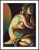
Something New This roundism oil painting is quite different from the last roundistic one, called ‘Singularity – 23-12-21’. Whereas the latter was all about the use of shiny colors, the experiment at hand has another color range. Maybe I felt I needed a change from mother-of-pearl and metal paints. That was fun too but to me creating art is all about the process of finding something new. Of late I have tried out some different, more expressionistic color schemes like the combination of greens and reds. Such resulted in a colored pencil drawing ‘Risque – 18-01-22’ and an oil ‘Risque – 13-12-21’. Speed Things Up Especially the latter I like, not in the last place because I made that one in a couple of days. The Singularity painting took me half a year. Even though I like to have some big projects in progress, some medium sized paintings are necessary too. They enable me to try out new things and speed up the process of painting. Not that speed in itself is a goal but to prevent myself from becoming too shy and prudent. Painting only high-end surrealist works full of details is a mighty craft but won’t evoke the daredevil in me. Therefor I put myself the task of completing this one in three days. I almost managed to do so. Half a day in addition. New Color Scheme And why not crank up the volume of oils? After all, I made all these graphite pencil drawings I still consider prestudies in some sort of way. These A4-sized drawings started out as doodles waiting for my students at Brugman Art. Actually I am amazed by the fact I sold so many in the past. Anyway, time to lay them all out to be put in oil. I happened to have bought some new paints. I felt I kind of got stuck in the same kind of color schemes all the time. So I bought some lovely earth pigments like Schmincke Pozzuoli earth and Pompeian red. I combined them with Old Holland nickel yellow and yellow-brown. As cool colors I used Rembrandt Sèvres green and combined black with ultramarine to get a deep dark tone. It serves as a ligament throughout the entire painting, welding all colorful parts together. Romy Roams Around The result is quite surprizing but I like it. I think I will do another one with these same colors. The portrait by the way evolved into a slight resemblance to Romy Schneider. One of the most beautiful women I have ever saw. Is that a coincidence? Oil on linen (60 x 80 cm) Artist: Corné Akkers
Roundism – 04-02-22 was created by artist Corne Akkers in 2022. This art piece , which is part of the Oil Paintings - Corne Akkers portfolio, is a Paintings artwork. The style of this artwork is best described as Cubism, Fine Art. The genre portrayed in this piece of art is Anatomy, Composition, Figurative, Inspirational, Nudes, People. The artwork was created in Oil. The size of the original art is 80 (cms) H x 60 (cms) W.
Words which artist Corne Akkers feels best describe this work of art are: abstract, akkers, artist, artista, artiste, arts, művészet, corne, cubism, corneakkers, cubisme, cubismo, cubist, cubistic, ölgemälde, olieverf, dutch, female, femme, finearts, frau, 艺术 , कला , buyart, iloveart, kubistisch, nghệthuật, nackt, inspiration, creative, nude, nu, desnudo, oilpainting, creativity, painting, inspirational, seni, sanat, في, naakt, oil, kübizm, abstractie, kubisme, kubist, الرسم, кубизм, مذهب, art, 인상주의, roundism, សិល្បៈ, rondisme, 立體主義, 立体主义, キュビズム, کوبیسم.
About Corne Akkers
My work can be seen in many countries all over the world. I employ a variety of styles that all have one thing in common: the ever search for the light on phenomena and all the shadows and light planes they block in. My favorites in doing so are oil paint, dry pastel and graphite pencil. It is not the form or the theme that counts but the way planes of certain tonal quality vary and block in the lights. Colours are relatively unimportant and can take on whatever scheme. It is the tonal quality that is ever present in my work, creating the illusion of depth and mass on a flat 2d-plane. I combine figurative work with the search for abstraction because neither in extremo can provide the desired art statement the public expects from an artist. Besides all that, exaggeration and deviation is the standard and results in a typical use of a strong colour scheme and a hugh tonal bandwith, in order to create art that, when the canvas or paper would be torn into pieces, in essence still would be recognizable.
I teach art (drawing / painting) at Voorburg, Netherlands where I have my second studio next to my first at The Hague, Netherlands, where I live.


