-
Solarized Geometry – 10-09-20
- Artist Name Corne Akkers
- Year 2020
- Portfolio Name Drawings - Corne Akkers
- Art Form Drawings / Sketch
- Size 21 (cms) H x 30 (cms) W
- Style Cubism, Fine Art, Surrealism
- Genre Anatomy, Composition, Figurative, Inspirational, Nudes, People
- Media Pencil
- Price $1,700.00
- Keywords arte, art, arta, artista, artiste, artist, seni, sanat, kunst, فن, 艺术, कला, corne, akkers, corneakkers, clairobscur, creative, inspiration, graphite, drawing, pencildrawing, pencil, potlood, bleistift, impression, realism, cubiste, kubisme, искусство, cubismo, cubistic, kubistisch, kubist, アート, الرسم, кубизм, Κυβισμός, kubismi, lập thể, 입체파, ਘਣਵਾਦ, مذهب, קוביזם, 立體主義, キュビズム, արվեստ, művészet, solarisation
-

Canvas -

Paper/Poster -

Metal -

Coffee Mug
(various colors) -

Magic Color Changing Mug -

Men T-shirt
(various colors) -

Men's Vapor Apparel T-shirts
(various colors) -
Men's Vapor Apparel Long Sleeves
(various colors) -

Men's Vapor Appareal Performance Hoodie Long Sleeve Sweatshirt
(various colors) -

Men's Vapor Apparel Solar Performance Polo T-Shirts
(various colors) -

Men's Vapor Apparel Performance Long Sleeve Sweatshirts
(various colors) -

Youth Basic T-shirts
(various colors) -

Youth Solar Performance T-shirts
(various colors) -

Women's T-Shirts
(various colors) -

Women's Vapor Apparel Solar Performance Short Sleeves
(various colors) -

Soft Mouse Pad -

Rosewood Wine Gift Box -

Laptop Shoulder Bag -

Shopping Tote Bag
(various models) -

Flip Flops -

Slide On Sandals -

Satin Pillow Case -

Travel Luggage Tag (Fiber Reinforced Plastic) -

Glass Coaster
(various shapes) -

Gloss White Hardboard Coaster with Cork Back
(various shapes) -
Name Badge
(various shapes) -

Solid Red Alder Pet Urn
(various sizes) -

Lunch Tote with Handle -

BBQ Set in Wooden Pine Box -

Hardbound Portfolio Cover for Legal Note Pad Inside -

Wine and Cheese Gift Box -

Aprons
(various models) -

Gift Box With Ceramic Tile -

Puzzles
(various shapes) -

Rectangular Glass Cutting Board -

Cooler Bag -
Serving Trays
(various options) -

Small Fleece Baby Burp Blanket -

Baby Onesies


Product Description
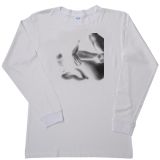
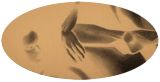
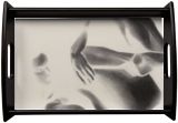
Solarized Geometry – 10-09-20 Solarized Geometry After my drawing Roundism – 29-08-20 it was time to delve into this type of solarized geometry. The latter is about properties of space that are related with distance, shape, size, and relative position of figures. The square, triangle and circle in the upper left corner are a reminder that whatever complex form we might see it is build up from simple geometrical sub-forms. As such, this is an old principle every art student at art school before the World War II was trained in, when students actually still learned something of value. Ambiguous Image? Through the process of solarization I found these abstract forms derived from the female body that I could use to abstract, but only a little bit, just to have the spectator interpret them both at the same time. Moreover, I thought it was fun to see if the principle of an ambiguous image works the same way with geometry and body shapes. Further Abstraction Perhaps I can take the abstraction into solarized geometrical forms even further and this might bring me something ‘post-roundism’ because I think the style feels a little exhausted for the time being. Perhaps I will work out some oil paintings based after these roundism drawings. Time to move on. Got any ideas? Graphite pencil drawing (Sakura 0.5 mm, Pentel 4B) on Winsor & Newton paper (21 x 29.7 x 0.1 cm) - A4 format) Artist: Corné Akkers
Solarized Geometry – 10-09-20 was created by artist Corne Akkers in 2020. This art piece , which is part of the Drawings - Corne Akkers portfolio, is a Drawings / Sketch artwork. The style of this artwork is best described as Cubism, Fine Art, Surrealism. The genre portrayed in this piece of art is Anatomy, Composition, Figurative, Inspirational, Nudes, People. The artwork was created in Pencil. The size of the original art is 21 (cms) H x 30 (cms) W.
Words which artist Corne Akkers feels best describe this work of art are: arte, art, arta, artista, artiste, artist, seni, sanat, kunst, فن, 艺术, कला, corne, akkers, corneakkers, clairobscur, creative, inspiration, graphite, drawing, pencildrawing, pencil, potlood, bleistift, impression, realism, cubiste, kubisme, искусство, cubismo, cubistic, kubistisch, kubist, アート, الرسم, кубизм, Κυβισμός, kubismi, lập thể, 입체파, ਘਣਵਾਦ, مذهب, קוביזם, 立體主義, キュビズム, արվեստ, művészet, solarisation.
About Corne Akkers
My work can be seen in many countries all over the world. I employ a variety of styles that all have one thing in common: the ever search for the light on phenomena and all the shadows and light planes they block in. My favorites in doing so are oil paint, dry pastel and graphite pencil. It is not the form or the theme that counts but the way planes of certain tonal quality vary and block in the lights. Colours are relatively unimportant and can take on whatever scheme. It is the tonal quality that is ever present in my work, creating the illusion of depth and mass on a flat 2d-plane. I combine figurative work with the search for abstraction because neither in extremo can provide the desired art statement the public expects from an artist. Besides all that, exaggeration and deviation is the standard and results in a typical use of a strong colour scheme and a hugh tonal bandwith, in order to create art that, when the canvas or paper would be torn into pieces, in essence still would be recognizable.
I teach art (drawing / painting) at Voorburg, Netherlands where I have my second studio next to my first at The Hague, Netherlands, where I live.


