-
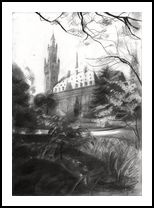
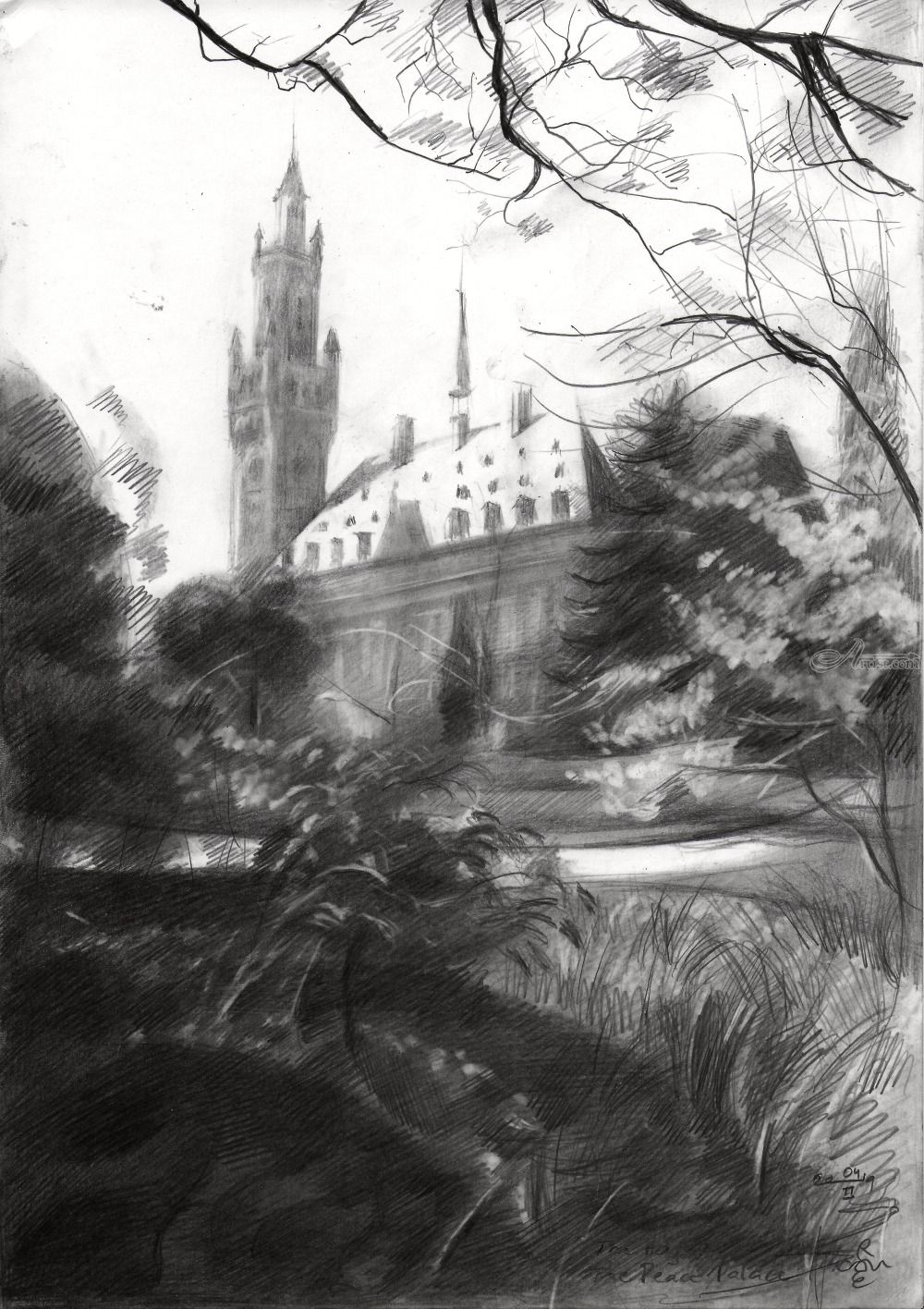
The Peace Pace at The Hague – 04-02-19
- Artist Name Corne Akkers
- Year 2019
- Portfolio Name Drawings - Corne Akkers
- Art Form Drawings / Sketch
- Size 30 (cms) H x 21 (cms) W
- Style Abstract, Cubism, Fine Art, Impressionism, Realism
- Genre Architecture, Composition, Figurative, Historical, Inspirational
- Media Pencil
- Price $340.00
- Keywords akkers, artist, artista, arts, clairobscur, corne, corneakkers, drawing, 인상주의, figurative, finearts, 印象派, hatching, 印象派, kunst, city, Импрессионизм, אימפרסיוניזם, cityscape, impressionism, thehague, impressionism, graphite, pencil, potlood, tekening, zeichnung, انطباعيةr, abstractie, art, arte, arta, artista, artiste, artist, realism, realisme, realistic, realiste, realist, kunst, 藝術, アート, искусство, արվեստ, קונסט, nghệthuật, فن, ხელოვნება, művészet, 艺术, seni, សិល្បៈ, कला, 印象派, treescape
-

Canvas -
Paper/Poster -

Metal -

Coffee Mug
(various colors) -

Magic Color Changing Mug -

Men T-shirt
(various colors) -

Men's Vapor Apparel T-shirts
(various colors) -

Men's Vapor Apparel Long Sleeves
(various colors) -

Men's Vapor Appareal Performance Hoodie Long Sleeve Sweatshirt
(various colors) -

Men's Vapor Apparel Solar Performance Polo T-Shirts
(various colors) -

Men's Vapor Apparel Performance Long Sleeve Sweatshirts
(various colors) -

Youth Basic T-shirts
(various colors) -

Youth Solar Performance T-shirts
(various colors) -

Women's T-Shirts
(various colors) -

Women's Vapor Apparel Solar Performance Short Sleeves
(various colors) -

Soft Mouse Pad -

Rosewood Wine Gift Box -

Laptop Shoulder Bag -

Shopping Tote Bag
(various models) -

Flip Flops -

Slide On Sandals -

Satin Pillow Case -

Travel Luggage Tag (Fiber Reinforced Plastic) -

Glass Coaster
(various shapes) -

Gloss White Hardboard Coaster with Cork Back
(various shapes) -

Name Badge
(various shapes) -

Solid Red Alder Pet Urn
(various sizes) -

Lunch Tote with Handle -

BBQ Set in Wooden Pine Box -

Hardbound Portfolio Cover for Legal Note Pad Inside -

Wine and Cheese Gift Box -

Aprons
(various models) -

Gift Box With Ceramic Tile -

Puzzles
(various shapes) -
Rectangular Glass Cutting Board -

Cooler Bag -

Serving Trays
(various options) -
Small Fleece Baby Burp Blanket -

Baby Onesies


Product Description
The Peace Pace at The Hague – 04-02-19 The reference picture I used I took last year at the brink of spring. Since this (today – 4nd February 2019) was a particularly windy and cold day I used this motif in order to evoke spring I guess. I kept the International Court of Justice building (‘the Peace Palace’) quite vague and I also sketched with a rough edge more that I am used to in previous drawings and decided such was more suited to work it towards a more impressionistic look than cubistic / roundish, even though some parts in the foreground show my initial roundism intentions. Graphite pencil drawing (Pentel 0.5 mm, 3B) on Canson Bristol paper (21 x 29.7 x 0.1 cm - A4 format) Artist: Corné Akkers
The Peace Pace at The Hague – 04-02-19 was created by artist Corne Akkers in 2019. This art piece , which is part of the Drawings - Corne Akkers portfolio, is a Drawings / Sketch artwork. The style of this artwork is best described as Abstract, Cubism, Fine Art, Impressionism, Realism. The genre portrayed in this piece of art is Architecture, Composition, Figurative, Historical, Inspirational. The artwork was created in Pencil. The size of the original art is 30 (cms) H x 21 (cms) W.
Words which artist Corne Akkers feels best describe this work of art are: akkers, artist, artista, arts, clairobscur, corne, corneakkers, drawing, 인상주의, figurative, finearts, 印象派, hatching, 印象派, kunst, city, Импрессионизм, אימפרסיוניזם, cityscape, impressionism, thehague, impressionism, graphite, pencil, potlood, tekening, zeichnung, انطباعيةr, abstractie, art, arte, arta, artista, artiste, artist, realism, realisme, realistic, realiste, realist, kunst, 藝術, アート, искусство, արվեստ, קונסט, nghệthuật, فن, ხელოვნება, művészet, 艺术, seni, សិល្បៈ, कला, 印象派, treescape.
About Corne Akkers
My work can be seen in many countries all over the world. I employ a variety of styles that all have one thing in common: the ever search for the light on phenomena and all the shadows and light planes they block in. My favorites in doing so are oil paint, dry pastel and graphite pencil. It is not the form or the theme that counts but the way planes of certain tonal quality vary and block in the lights. Colours are relatively unimportant and can take on whatever scheme. It is the tonal quality that is ever present in my work, creating the illusion of depth and mass on a flat 2d-plane. I combine figurative work with the search for abstraction because neither in extremo can provide the desired art statement the public expects from an artist. Besides all that, exaggeration and deviation is the standard and results in a typical use of a strong colour scheme and a hugh tonal bandwith, in order to create art that, when the canvas or paper would be torn into pieces, in essence still would be recognizable.
I teach art (drawing / painting) at Voorburg, Netherlands where I have my second studio next to my first at The Hague, Netherlands, where I live.


